What’s Your UX Design Process?
What’s the point of a snazzy digital design if no one wants it? And why put your team through hell getting it done?
You stand a much better chance of achieving your online business goals by using an established process. This allows you space and time to clearly define who the product is for, what they get, and what you want them to do next.
A Sample UX Design Process
Despite the rapid technology changes of the past several years, my typical UX design process has largely stayed the same. While it’s not perfect, it’s based on developing a clear understanding of user needs and business goals.
This process continues to evolve after many years of working on over 150 corporate web design and app projects. I’ve also learned from many UX thought leaders such as Steve Krug, Jeff Gothelf, Christina Wodtke, Russ Unger, and Leah Buley.
Learning from fellow colleagues and attending UX design conferences such as UIE and South by Southwest also helps. Staying on top of the latest design patterns and trends is definitely a challenge, but thankfully there are tons of good UX resources available if you look for them.
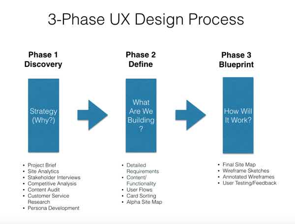
While not every project is big enough to use this over-arching UX design process, most large projects I work on do follow it pretty closely. Here’s a rundown of how it works.
The Project Brief
Why are you doing the project? What are your initial goals and planned outcomes? Who’s working on it? What are their roles and responsibilities?
Even though you may not have any hard user data yet, a simple one-page project brief will clarify your overall goals, who will be involved, what will be expected of them and how you will measure success. This, along with a Lean Canvas exercise, will help you and your team get aligned from the beginning.
Start With The User
It all begins with figuring out who is actually using your site or app. If it’s a site redesign, I ask for access to Google Analytics or whatever analytics tool my client uses. If it’s a brand new initiative, we start with a hypothesis and go straight to user interviews and surveys (see below).
Site Analytics
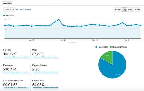
For existing websites, the first step is to take a good look at overall site traffic. I like to take monthly, quarterly and annual snapshots. The longer the data window the better your chances of spotting any trends.
It’s very useful to look for patterns. For example, do people bounce off your site after they visit the home page? Does the home page get the most traffic, or are people coming to your site via a subpage?
Most of my site traffic comes from what I like to call “side door traffic”. People usually find me through a Google search looking for examples of UX proposals or UX sketching. But my post on gifts for UX designers gets the most traffic of all during the Holiday season.
This is why it’s important to take a look at traffic patterns over at least a year and compare them against smaller windows of time. This lets you confirm actual trends vs. periodic spikes in user traffic.
Besides total unique users, page views and bounce rates, I like to see what paths, if any, users are taking through the site. If there is a large drop-off from one step to the next, this can indicate a “hole” in the site where the user isn’t satisfied and clicks elsewhere.
It’s also important to take a look at your overall mobile traffic. As of this writing, more than 50% of people are probably viewing your content on a mobile device, so you want to make sure your site is optimized appropriately. Amazingly, 90% of corporate websites are still not designed for responsive or adaptive layouts.
Card Sorts and User Interviews
I’ve worked on lots of marketing websites that either a) didn’t have time or budget or b) scoffed at the idea of actually talking to users about what they wanted on a given website. This misguided approach often results in missed opportunities and/or releasing a product that no one wants.
Thankfully the tide is turning. More organizations see the value of actually speaking to real people before investing in a huge design effort. There is no way to ever know what another person is thinking, which is why it is so critical to ask.
Recently I conducted a card sort using OptimalSort, an online card sorting tool by Optimal Workshop. A card sort is a UX technique used to determine how other people might group and label your content. This helps business owners understand what their users think is relevant.
For our card sort we recruited 35 actual customers to participate and received some great insights to help us create the site’s information architecture.
We also conducted a short user survey that asked several key questions about what people wanted to see on the newly designed site. Our questions were based on our initial hypothesis and then validated with real user data.
Customer Service Calls / Logs
If you are working with a larger company, you can often get access to the customer service department. This is absolute gold, because customer service personnel are on the front lines of the customer experience.
Try to get permission to listen in on a series of customer service calls. By listing live as a “fly on the wall”, you can often gain insights that are not possible to get any other way. If you can’t tap into the actual calls or access email logs, it’s also good to interview customer service management as a backup.
What Are Users Actually Doing On Your Site Right Now?
If you can’t work directly with users, there are many wonderful tools available to help you get valuable intel on exactly what people are doing and thinking when they visit your website.
Inspectlet is a perfect example. Using the free version, you can record up to 100 video sessions a month that show exactly what users do when they visit your site. All you have to do is copy and paste a tiny piece of Javascript code to get this incredibly valuable user data.
Stakeholder Interviews
While users get most UX headlines, it’s just as important to speak with business owners. After all, the whole reason a product exists is to make a profit for the business. If it doesn’t, there won’t be any users because there won’t be any business.
While anyone who has input on a web design or app project is a stakeholder, getting participation from business stakeholders is crucial to any successful product launch. These subject matter experts know more about what’s most important to the business than a designer or developer ever will. Make sure you spend the appropriate amount of time asking them what matters.
Kim Goodwin has an excellent article on Boxes and Arrows about how to conduct successful stakeholder interviews. It’s a great primer and will inspire you to ask other questions as you go along.
Competitive Analysis
Besides understanding users and stakeholders, it’s also important to understand where your product lies in the competitive landscape. You’ll want to look at anywhere between 3-5 of your top online competitors and do a SWOT analysis (strengths, weaknesses, opportunities and threats) of each.
By doing this you’ll get all sorts of great information on whether or not your competition has a current, effective design. You’ll also get a sense of how you can differentiate your product.
While you can’t get direct access to your competitor’s analytics, you can get a good idea on how their sites are performing using a collection of free tools. Hubspot’s Website Grader is a great place to start, followed by tools by SEMRush and Alexa. If you have paid versions of these products you can go even deeper.
Concept Models
Next, it’s useful to create a concept or task model. This is a document that represents what people want to achieve and how they get there. Similar to a user flow, you want to identify the steps people take and the decisions they need to make to achieve their desired goal.
Taking the time to think carefully about the user’s expectations about how they get from from point A to point B can have a huge impact on whether or not your site or app “feels” right to them. This can greatly increase conversion rates and task completion rates in apps.
A well-thought out task model offers a better chance of designing what the user expects. This often results in increased efficiency and conversion rates.
Content Audits
A content audit is an opportunity to evaluate every piece of content available on the current site or app. The purpose of a content audit is to review all existing site content and functionality, identify what to keep, what to delete, and what new content/functionality needs to be created.
Content audits are usually divided into two parts. A quantitative content audit is simply an inventory of everything that is there plus links. A qualitative content audit reviews each entry for things like tone of voice, accuracy, consistency, currency, and whether anything is missing.
After conducting both types of content audits, you will have a deep understanding of what needs to happen for your site or app communicate more clearly to your audience.
Persona Development

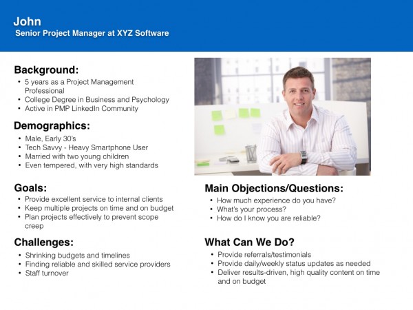
Once you have a collection of well-researched information about your users, you’ll have a good idea about who they really are. This is what Personas are all about. For me, research-backed Personas represent the last piece of the Discovery puzzle and will guide all design decisions going forward.
Effective use of personas can help deter the “shiny object syndrome” that often accompanies web and app design projects. That’s when a stakeholder comes into a meeting with an article on the latest hot design trend and wants to implement it just because it’s cool.
Defining Requirements
Doing all this up front work enables you to clearly define your site or app’s requirements for the best possible user experience. Any content or functionality on a website or app should only be there if it adds value. Every potential feature should clearly support user needs and business goals. As Einstein said, everything should be as simple as it can be, but not simpler.
Get your team together to review all of the available research and decide what should and should not be included. You can also use this time to vet the latest design trend du jour against your personas and other user research to see if it holds muster. If it doesn’t, set it aside and move on.
Well-researched user data allows you to have effective, informative and constructive conversations with your stakeholders instead of arguments based on loose assumptions. This in turn leads to better design decisions across the entire project lifecycle.
Defining Success Metrics
How will you know your efforts have succeeded? What results do you expect? You may have already defined a preliminary set of key performance indicators, or KPI’s, in your project brief. Be sure to revisit them once all of your user data is in hand, in since you may need to make updates or adjust stakeholder expectations.
Site Map and Wireframes

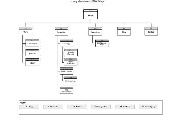
Once requirements have been clearly defined, the next stage in the process is to create the blueprints, or information architecture. Also known as a sitemap and wireframes, these early stage design documents represent the the content and functionality of the proposed website or app.
Think of your website or app as a new house. Before you shell out a lot cash to have someone build it for you, you would probably hire an architect to help you create the overall vision. A sitemap gives you a 50,000 view of how a website or app is organized, while wireframes help you envision how content and functionality will work together at the screen level. The two work together to help the team create a shared understanding of the final product.
User Testing and Feedback
Testing your designs with real users and getting their feedback is valuable at every stage of the process. You can conduct user tests with simple sketches, high-fidelity wireframes or fully interactive prototypes as you go along. You can recruit participants yourself or use proven testing services such as UserTesting.com for a fee. Just test early and often for the best results.
Make More Informed Design Decisions
All of this research enables design teams to have richer conversations so they can make more informed, intentional design decisions. Could you fire up Photoshop and start designing from scratch without doing all of this up front work? Of course. But by doing that you run the huge risk of experiencing miscommunications, production delays, cost overruns, and releasing a product that no one wants.
Don’t rush your digital product to market. Instead, think everything through from the abstract to the concrete and set yourself up for success. You will likely meet or exceed both your user’s expectations and your business goals. And isn’t that the whole point?
Over To You
What’s your UX design process? What kind of experiences have you had with the above activities? What worked and what didn’t? Please continue the conversation in the comments. And as always, thanks for reading!


