UX In Typography
“Typography is what language looks like.” -Ellen Lupton, Thinking With Type
Did you know that on average, people remember 80% of what they see vs. only 20% of what they read?*
Since our brains are hard wired to understand visuals more than text, it’s a good idea to make that text as visually appealing as possible. That’s where UX in typography comes in.
There are already loads of scholarly typography articles all over the web, so I’ll share just a few tips on how you can improve the digital user experience by making good typography choices. But first a little backstory.
It All Began With Mr. Gutenberg
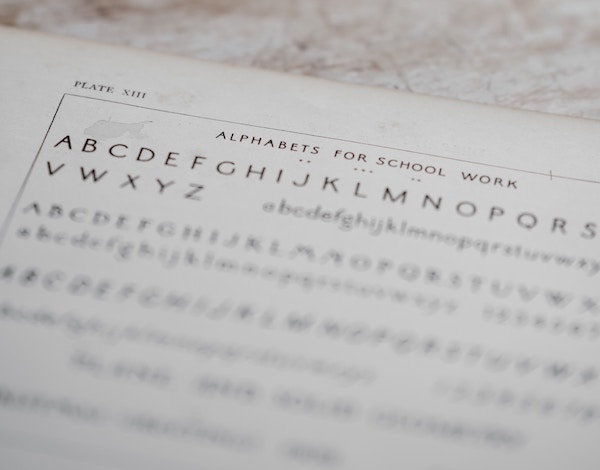
Typography is a tool used to shape content and give language a physical body on the page or screen. The first physical typefaces were manufactured over 500 years ago.
Usually made from lead or wood, these manufactured images were based on calligraphy and designed for infinite repetition. The launch of the Gutenberg Bible in 1454 changed the world, making it possible for the masses to access literature at last.
Fast forward to the 21st century. In the digital world, great content encourages people to read and interact with your message. To keep them interested, designers use typography to establish contrast and communicate a website or app’s visual hierarchy.
Here are some ideas to help people stay with you instead of clicking off to the next shiny internet object…
Headlines
As trends move to a more and more visual web, a typical website headline is now 38 pixels tall*. Since you only have a few seconds to get your user’s attention, make it big and bold.
Serif or sans serif fonts are acceptable as long as they’re one or the other and legible. The same goes for using all caps in headlines. Consistency is key.
Body Copy
Readers will spend the majority of their time reading your body text, so make it worth their while. Current best practices for paragraphs are to use font sizes between 14-16 pixels, with 2/3 of most popular websites using sans serif fonts*. Another good rule of thumb is to include line spacing that’s 1.5 times the height of a given font.
For estimating ideal paragraph width, here’s a super-handy trick I learned from Erik Kennedy. Paragraph width should be no more than two to three alphabets long.
Type out the alphabet, all 26 letters, and place it on the page. Then copy and paste it twice. I’ve done it for you below. You’re welcome :)
abcdefghijklmnopqrstuvwxyzabcdefghijklmnopqrstuvwxyzabcdefghijklmnopqrstuvwxyz
Choosing Fonts
Now this is a big old can o’ worms. In the interest of keeping you reading this post, I’ll spare you the debate.
To paraphrase author Ellen Lupton in Thinking With Type, choosing fonts is like making a salad. Each ingredient should have a role to play with plenty of contrast.
For many mobile apps it’s best to choose only one font because the screen is smaller and it’s not easy to use a variety of typefaces. Here are the big three I think of when choosing fonts for a website or app:
- Body fonts (paragraphs)
- Title Fonts
- Menus, buttons, anything interactive
Here’s some tips for choosing body fonts:
- Any font name with “text” in the name is designed specifically for body text and legibility at small sizes.
- Monospace and handwritten fonts are no bueno when you’re designing for legibility.
- Body fonts need to be legible – stay away from anything distracting. It will make your brain hurt trying to read it. Simple and readable wins the day.
- Good body fonts should have italic and bold options.
And of course when choosing fonts, make sure whatever you choose plays well with different sized screens, especially mobile devices.
Test Everything For Legibility
Font choices and colors for headlines, body copy, and any other text should all be tested by real people. That’s the only way you will know for sure if the design achieves its goal. Your mileage may vary, so test everything for legibility and adjust based on user feedback.
Content Is Still King
If you read this far, you read far more than 20% of this post, so thanks! The bottom line is that no matter how visually stunning your design is, your content must be useful, usable and valuable or your audience won’t stick around.