How To Write Storyboards For Hero Banners
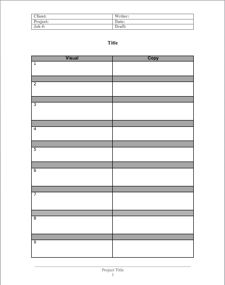
Most corporate websites have hero banners on them, which are usually visual animations used to draw attention to the home page. These components can be very effective or fall completely flat, depending on the strategy behind them. In this post I’ll show you how to write them from concept to finished piece, and provide you with a hero banner copywriting template to download.
Team Up With Your Designer
The first step is to team up with a dedicated designer. Besides design skills, this person should also be comfortable with front-end HTML5 and CSS3 production. You will be working closely together, so it’s a good idea to make sure each of you has either 1) a copy of the agency creative brief or 2) been briefed personally by the company on the goals and objectives of the piece. It’s critical that you both are on the same page, so make sure you and your designer know what’s going on.
Once you understand what the client wants to accomplish with their hero banner, the next step is to do some rough concepting. From a writing standpoint, for me this usually involves brainstorming and sketching in a big notebook, ideally with my designer, either on the phone or in person.
While it’s totally possible to come up with great ideas on your own, I find it’s always better to collaborate with two or more people. We schedule a dedicated time to brainstorm and get down as many ideas as possible. As soon as we’ve done some riffing and refining, it’s time to crack open the word processor.
Use A Template To Separate Visual Descriptions From Copy
Once we’ve agreed on two or three potential concepts, I go off to document them in Microsoft Word or Google Docs. I use a simple two-column template to create a written storyboard. The left column is used to describe the visuals and the right column is used for specific copy used in the final piece.
Since clients often have trouble understanding abstract concepts, we usually use this as an internal document. My designer depends on it to guide image searches and to create a more polished, visual PDF storyboard of each concept for client approval.
Each panel of the storyboard template is numbered and named for easy reference later. Besides writing punchy, accurate copy, it’s super important to also describe the visuals, any functionality and transitions as concretely as possible.
I find that describing the visuals first helps me write better copy. Image searches are often very time consuming for designers, so try to eliminate as much ambiguity as you can in your descriptions. Your designer will thank you.
Taking Turns
When the copy template is completed, it’s the designer’s turn to transform each concept into a PDF storyboard with proposed images. There’s usually a lot of back and forth at this point, since using actual images can often inspire added refinements. When everyone agrees intertnally that the client’s goals have been met, it’s time to present your storyboards to them.
Client Revisions
And now the fun begins. Hero banners often become mini-projects within a larger web design project, so beware of scope creep here. Since animations are so subjective, clients will often want to change images, copy, even placement of various elements after choosing a concept direction.
So make sure you agree on how many rounds of revisions you are willing to provide. That way you’ll know just how deep the rabbit hole goes. I recommend no more than 2 rounds, with a change order after that if your clients keep changing their minds.
Eventually your client will approve the storyboard and it’s time to build the actual banner. And that’s another blog post entirely. Probably a guest post.
Your Turn
What’s your experience doing copywriting for hero banners and other interactive elements? Would you do anything differently? Please leave your thoughts in the comments.


