The 30-Day Web Design and Development Challenge, part 3
The 30-Day Web Design and Development Challenge continues! This week was all about starting design. Using my completed sitemap from part 2 and notes from Discovery, I created wireframes for the home page and portfolio pages.
Home Page Wireframe
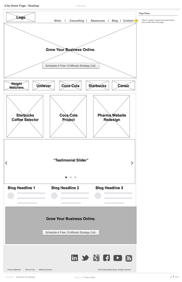
My primary goal for the new site is to get potential clients to schedule a free 15-minute qualification call. I have a specific sales process for both corporate and UX coaching clients, so hopefully this new design will steer interested people in the right direction. Taking the time to wireframe out the home page really helped me focus on this end goal.
To encourage people to schedule a call, I’ve got a big call to action button right in the middle of the hero image. I’ll include several client logos underneath this image as credibility indicators.
Next, I’ll feature several projects that are either unbranded or don’t have NDAs. Luckily I have a few big ones that I can feature. My recent Discovery process helped me remember that!
From there I’ll highlight some customer testimonials, and then offer up my 3 most popular blog posts. At the bottom of the page I’ll restate the call to action.
Portfolio Page Wireframe
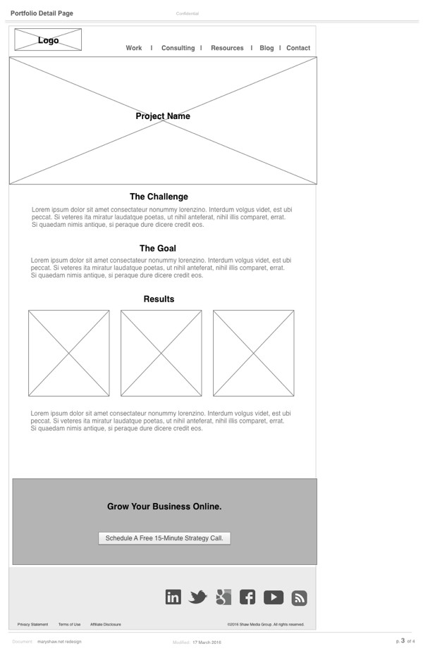
I’m excited to get started on this section. My current portfolio is a downloadable PDF that doesn’t have much detail on each featured project. On the new site I want to tell the story of several successful projects so that clients might imagine themselves also succeeding by working with me.
I also want clients to get familiar with my process, so I’ll present each project with the challenge, the end goal, and a summary of results.
Secondary Goals
My secondary site goal is to grow my email subscriber list. With the help of CovertKit, my email marketing software, I’ve been using several “upgraded” content documents, including a design proposal template, allocations spreadsheet and a persona template to drive email subscriptions. They were working pretty well last month, but seem to have fallen off this month. I’m thinking a 7-day email intro course on UX design might also attract this group.
Since maryshaw.net is such a small site and it’s just for me, I don’t think it’s necessary to wireframe out any existing pages. For example, I’ll continue to offer website reviews. It’s a great way for clients to get introduced to my services at very low risk. It’s also great for me, since I get a chance to know these people a little bit before we start working on a larger engagement.
Next Up: Visual Design
I was hoping to move everything into Photoshop this week, however an unexpected trip to Los Angeles pushed out the schedule (I’m writing this post on the plane somewhere over Nebraska at 28,000 feet). I’d still like to get the site launched by the end of March and am figuring out how to do that.
Since my site will remain in WordPress, I’ve decided to use X Theme from ThemeCo as a framework. X has an excellent reputation within the industry for looking great and speeding up workflow. Hopefully that will speed up design and development quite a bit and I’ll still make my March 31 deadline.
Timing Considerations
Even though this is a personal project, I’m treating it just like a client job. It’s the only way I was able to prioritize it and get it on my schedule. But I’m finding it’s just as challenging juggling this along with other work and family responsibilities.
Ironically my cross-country trip is actually giving me some much needed breathing room to get some work done I might not have otherwise. Aside from the occasional turbulence, planes are pretty quiet :)
Next Steps
Next week I’ll share some design comps and hopefully get some feedback. In the meantime, please let me know what you think of the wireframes in the comments. As always, thanks for reading!


