The 30-Day Web Design and Development Challenge, part 2
Welcome to part 2 of The 30-Day Web Design and Development challenge. In part 1 I threw down the gauntlet and announced I was redesigning this website. In this post I’ll review my progress for the week.
Discovery Phase
Last week was all about Discovery. Going through a proper discovery process is the first and most important step in any web design project. It’s an opportunity to identify site goals, define who the audience is, what they need, assess the content, look at the competition and come up with an overall strategy.
Taking the time to really look at all these factors helps to eliminate assumptions and identify all the moving parts in a web design project. It’s also the only way to truly define what will make it a success.
Lean Canvas
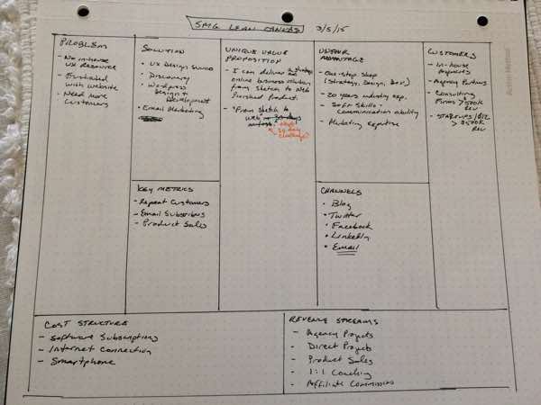
This year I’ve been taking all my new clients through a Lean Canvas exercise as the first step of the discovery phase. So far it’s worked out really well. Since I’m the client for this project I decided to create my own Lean Canvas. Here’s what I found out:
Ideal Clients
My primary web design or UX consulting client has a business with >$500k in revenue and is willing to invest at least $10,000 into digital marketing.
While I’ve previously built my business working primarily with Fortune 500 companies and agencies, these days I’m targeting small to midsize consulting firms and startups. These companies have the same types of problems as large corporations but can move much more quickly. I especially enjoy working closely with the founders and principals of these smaller organizations.
My secondary client is a junior UX designer looking for information and training resources to help them either get a job or go freelance. These people are ideal candidates for my 1:1 online UX coaching and training services.
Site Analytics
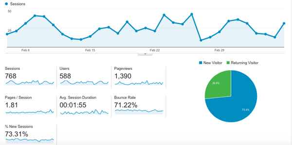
I’m always looking at Google Analytics to identify any trends. While my overall site traffic could certainly use a boost, my most popular post to date is about how to write a UX design proposal, followed by content on UX strategy and sketching. Traffic is pretty consistent during the week and then dips on the weekend. This pattern hasn’t changed much in the last year.
User Research
I sent a brief survey to my email list asking what they would like to see on the new site. Their feedback was also consistent with my most recent Google Analytics data. While nothing beats in-person interviews, I also learned a lot from some back and forth email conversations with a few subscribers.
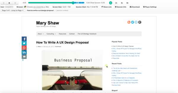
Last but not least, I spent some time looking at actual user sessions in Inspectlet, which is an incredibly useful user research tool. Again, the sessions were consistent among the three most popular topics mentioned above.
Competition
Next, I reviewed several other UX consulting sites and blogs with similar content to mine. Some were very good and some were a little cluttered looking.
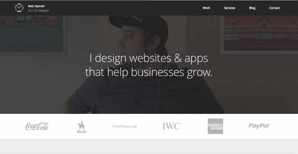
One site in particular seems to be very similar to where I want to go. Matt Olpinski is a very talented UX/UI designer. His site offers all sorts of great information for clients as well as budding freelancers, so it will be a great benchmark.
Content Audit
Over the years maryshaw.net has been a personal blog with a bolted on portfolio. I originally started it in 2009 to help me remember how to do stuff after I finished client projects. After doing a thorough review of my content I found several gaps and plenty of room for improvement.
Here’s a short list of things I’d like to change:
- No Home Page. I purposely omitted a home page a while ago in favor of blog content, but it’s time for a proper home page now. When people land on the home page they need to immediately know the answers to these three questions:
- What is it?
- Who is it for?
- What do I get?
- Add more clear calls to action besides email signups at the bottom of each article.
- My about page could do a better job of telling readers what’s in it for them if they decide to work with me.
- Productized consulting services: This is an area of my business I really want to expand, yet I don’t have dedicated marketing pages for each service yet.
- Positioning: Besides knowing what I do, people need to know who I am and what I stand for. I’ve been a bit shy about that in the past and need to spend some focused time defining this.
- Portfolio: Yep, this needs an upgrade too. I’m working on it!
Preliminary Site Goals
Based on what I know so far, here are my goals for the redesigned maryshaw.net:
- For the business: Attract and retain UX and web design clients with $10,000+ budgets.
- For my audience: Provide immediately useful, engaging and actionable UX and web design resources.
Success Metrics
How will I know if the redesign was a success? What will tomorrow look like?
I will have accomplished my goals if 1) I can attract 3-5 new consulting clients from the website within the next year, and 2) build my email list to over 500 subscribers.
Site Map
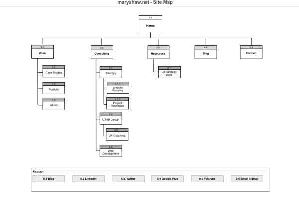
Based on all this upfront work, here’s a rough sitemap for the new site:
Hopefully visitors will know exactly what’s available and how to get what they want. As always, I won’t know for sure until I test it out on real users, which I will do once I have some design comps. I’ll be excited to share user testing results on the new design in part 3 of this series. Keep in mind that things will probably change a bit as I go along. That’s the beauty of iteration :)
Over To You
How has discovery helped you plan your design projects? What would you do differently? How do you like the proposed sitemap for the new site design? Please let me know in the comments.
Like this post? Please share it!

